
Go bold with color—because your countertops should reflect you.
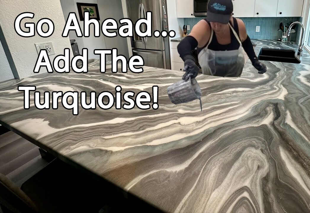
In this tutorial, we’re showing how a touch of turquoise can transform a custom epoxy surface into something vibrant and uniquely personal. Unlike granite or quartz, epoxy gives us the freedom to infuse color and character into every pour.
Whether you’re matching a favorite piece of décor or just craving something outside the norm, this is your sign to add that pop of color. In this video, we walk through the entire process—from planning the palette to pouring and blending the turquoise accents.
What You’ll Learn
- Design Planning – how to choose and balance bold accent colors
- Pigment Application – working turquoise into your pour without overpowering the design
- Movement & Flow – techniques to create natural flow that complements the accent color
- Layering for Contrast – using neutrals to make bold colors pop
- Finishing & Blending – final steps to ensure smooth result
Why It’s Worth Watching
- Custom Color Freedom – see how epoxy allows for bold design choices traditional materials can’t
- Visual Impact – great inspiration for anyone tired of beige-on-beige countertops
- Step-by-Step Process – watch exactly how we layered and blended the colors from start to finish
Pro Tips from the Video
- Start light—you can always add more color, but you can’t take it away
- Use a heat gun to blend and soften pigment lines for a more natural flow
- Anchor bold colors with neutral backgrounds to keep the look elegant and balanced